When installing a new concrete patio at your Twin Cities home, consider these popular colors.
Every time you step into your backyard, that dull gray concrete slab reminds you of an uncomfortable truth: your outdoor space looks like a warehouse loading dock instead of the inviting retreat you've been dreaming about. You're embarrassed when neighbors drop by, and you certainly don't feel excited about hosting summer gatherings on what basically looks like a commercial parking lot.
Here's the frustrating part—you know concrete is the right material for Minnesota. You've watched your neighbor's beautiful stone patio heave and crack through just one winter. You've seen another friend's expensive pavers separate and become trip hazards after two freeze-thaw seasons. Concrete is the only outdoor surface material that truly survives our brutal climate without constant maintenance. But why does "durable" have to mean "boring"?
The good news: it doesn't anymore. Modern concrete color technology has advanced dramatically, offering Twin Cities homeowners sophisticated, lasting color options that transform ordinary concrete into stunning outdoor features. The dated industrial gray slab is being replaced by warm, inviting tones that make you actually want to spend time outside—and feel proud to invite others to join you.
Before we dive into specific color trends, let's address why concrete color deserves serious consideration in your patio planning.
Your outdoor space should feel like a retreat, not a reminder of commercial construction. Color psychology research confirms what we intuitively know: different colors evoke different emotional responses. Cool grays can feel industrial and cold (fine for warehouses, less ideal for family gatherings). Warm tones create welcoming, comfortable spaces where people naturally want to linger.
The practical reality: You and your family will spend hundreds—possibly thousands—of hours on your patio over its 25-30 year lifespan. Those hours should feel enjoyable, not like you're tolerating subpar outdoor space because you can't afford to replace it.
When potential buyers view your property, curb appeal and outdoor living spaces significantly impact their valuation and emotional connection to your home. According to real estate data, well-designed outdoor spaces can return 60-80% of their cost in increased home value—but only when they actually enhance your home's overall presentation.
A dated, dull gray patio doesn't add value. It signals to buyers that outdoor spaces need updating, potentially reducing their offer or eliminating interest entirely. A thoughtfully colored, attractive patio signals quality, care, and move-in readiness—justifying premium pricing.
Minnesota's environment is harsh on outdoor surfaces. Pollen, dirt, organic debris, tree sap, and general grime accumulate quickly on patios. While pure gray shows every spot and stain, strategic color choices actually conceal everyday wear, keeping your patio looking cleaner between maintenance sessions.
The maintenance reality: Darker tones and earth-toned colors hide stains and patina that would be glaringly obvious on light gray or white concrete. This isn't about accepting dirty outdoor space—it's about choosing colors that remain attractive in real-world conditions between annual cleanings.
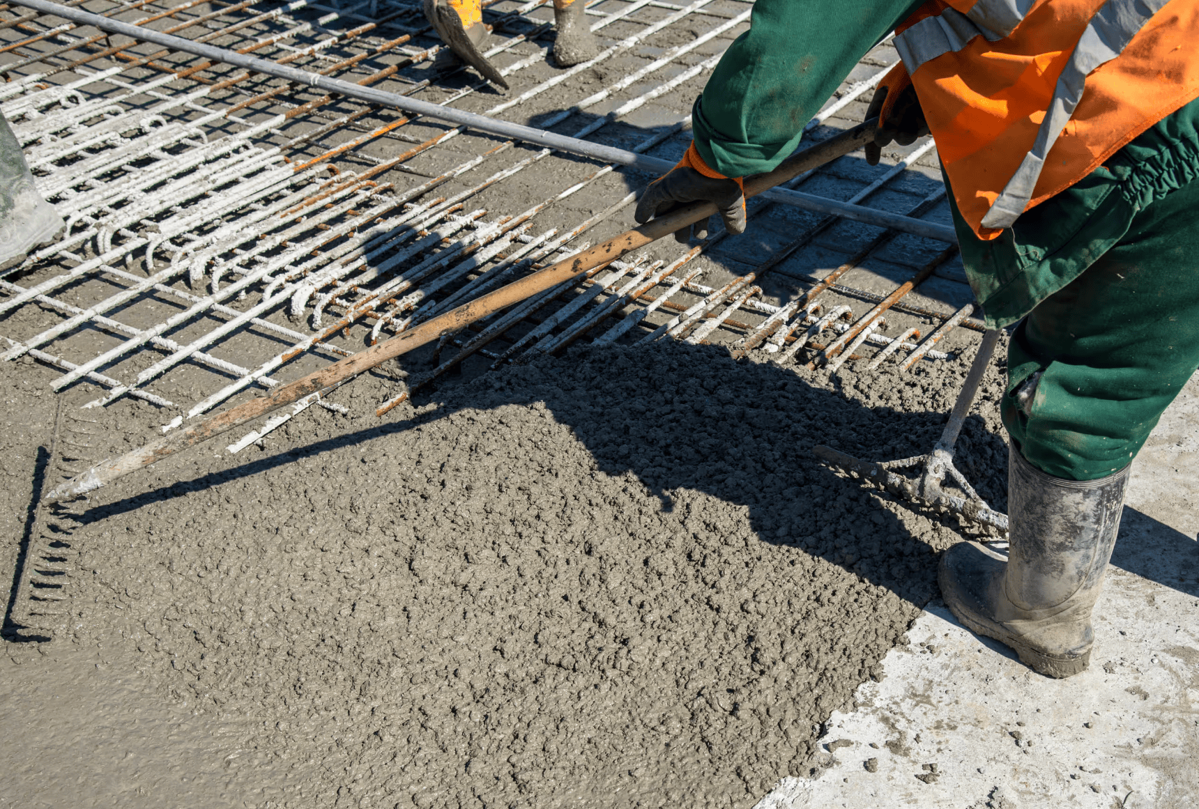
Before exploring specific color trends, you need to understand how color gets into concrete—because the method significantly impacts durability, appearance, and cost.
What it is: Pigments mixed throughout the entire concrete batch before pouring, making color a permanent part of the concrete itself rather than a surface treatment.
Advantages:
Disadvantages:
Best for: Homeowners planning to stay long-term, anyone wanting minimal maintenance, and situations where durability matters most. This is Preferred 1 Concrete's recommended approach for Minnesota patios.
What it is: Dry powder pigments broadcast onto freshly placed concrete during finishing, then troweled into the surface to create color while strengthening the top layer.
Advantages:
Disadvantages:
Best for: Stamped concrete where pattern needs enhancement, situations requiring maximum color intensity, or when combining with integral color for multi-toned effects.
What it is: Chemical reaction between metallic salts and concrete minerals creating translucent, variegated color effects unique to each application.
Advantages:
Disadvantages:
Best for: Existing patios needing color updates, homeowners wanting organic, unique appearances, or situations where earth-tone variegation complements landscape design.
What it is: Penetrating pigmented water-based stains that absorb into concrete pores, offering more color control than acid stains.
Advantages:
Disadvantages:
Best for: Budget-conscious projects, existing patio updates, or situations requiring specific colors not achievable through other methods.
Now let's explore the specific colors replacing traditional gray in Minneapolis backyards—and why each works so well in our climate and architectural context.
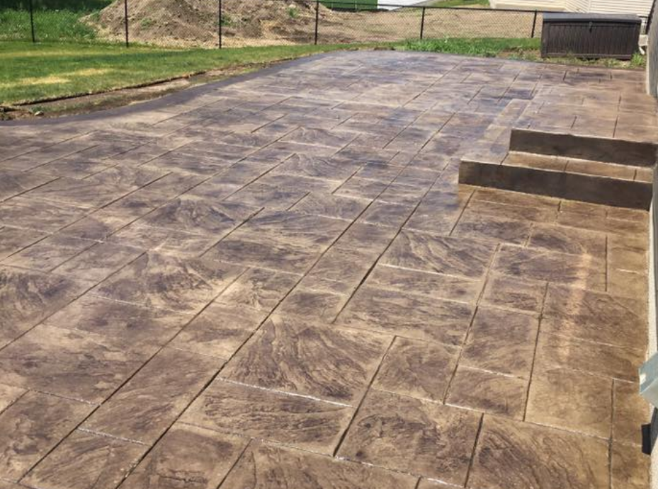
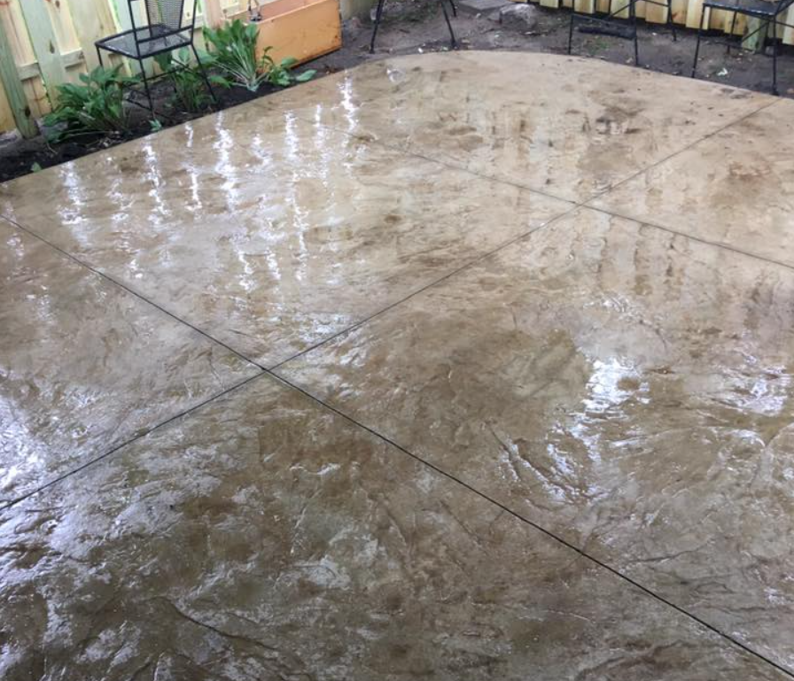
What it looks like: Sophisticated hybrid tones blending gray's contemporary feel with beige's warmth. Think aged limestone, weathered sandstone, or dried clay.
Why it's trending: These colors offer the best of both worlds—modern enough for contemporary homes, warm enough for traditional styles. They work beautifully with both cool-toned (gray, black, white) and warm-toned (brick, wood, earth colors) home exteriors.
Minnesota advantages:
Best for: Homeowners who love gray's sophistication but want more warmth, homes with mixed materials (stone and brick, wood and stucco), and large patios where pure gray might feel stark.
Color names to request: Buff, sandstone, natural gray, sedona, adobe
Typical cost: $10-14 per square foot with integral color
Real homeowner experience: "We chose a warm taupe for our Edina patio and couldn't be happier. It looks sophisticated without being cold, and it hides the dirt from our kids and dogs playing outside. Friends always comment on how much better it looks than their basic gray concrete."
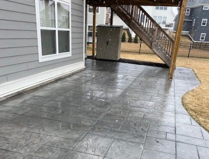
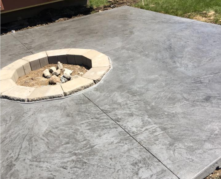
What it looks like: Rich, deep tones ranging from dark charcoal to slate blue-gray. Think thunderstorm clouds, deep river stones, or aged steel.
Why it's trending: The rise of modern farmhouse and contemporary architecture featuring black-frame windows, dark metal accents, and dramatic contrasts drives demand for these sophisticated dark tones.
Minnesota advantages:
Considerations:
Best for: Contemporary and modern homes, properties with black or dark-framed windows and doors, covered patios where heat absorption isn't an issue, homeowners wanting bold, sophisticated outdoor spaces.
Color names to request: Charcoal, slate, graphite, carbon, pewter
Typical cost: $11-15 per square foot with integral color
Design tip: Pair charcoal concrete with lighter gravel borders or lighter-toned accent areas to prevent the space from feeling too dark or heavy.
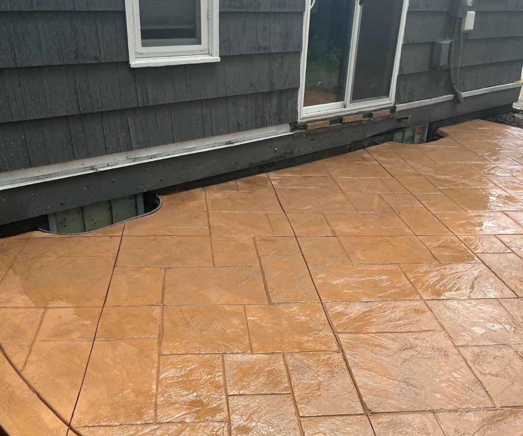
What it looks like: Earthy red-orange tones reminiscent of terra cotta pots, Arizona desert landscapes, or traditional clay pavers. Ranges from subtle peachy-pink to rich burnt orange.
Why it's trending: As Mediterranean and Southwestern design influences grow in popularity (particularly for covered outdoor living spaces and outdoor kitchens), these warm, earthy tones create inviting, sun-soaked atmospheres even in Minnesota.
Minnesota advantages:
Considerations:
Best for: Traditional, craftsman, or Mediterranean-style homes; brick homes needing cohesive outdoor space; covered patios and outdoor rooms; homeowners who love warm, welcoming color palettes.
Color names to request: Terra cotta, clay, russet, coral, sienna
Typical cost: $10-14 per square foot with integral color
Design strategy: Use terracotta as primary color with cream or tan accent borders, or apply in featured zones while using neutral tones in secondary areas.
What it looks like: Muted, dusty green tones inspired by natural vegetation—weathered sage, olive leaves, or lichen-covered stone. Definitely not bright or grassy green.
Why it's trending: The biophilic design movement (connecting architecture with nature) has made nature-inspired colors increasingly popular. Sage green creates organic, calming outdoor spaces that feel connected to surrounding landscaping.
Minnesota advantages:
Considerations:
Best for: Nature-lover homeowners comfortable with unique choices, heavily landscaped properties where green transitions feel natural, shaded patios where organic tones make sense, contemporary homes where unexpected color shows design sophistication.
Color names to request: Sage, olive, moss, willow, fern
Typical cost: $11-15 per square foot with integral color (premium pigments)
Design consideration: This works best as accent color or in smaller applications rather than large, uninterrupted surfaces. Consider combining sage green borders or insets with neutral primary color.
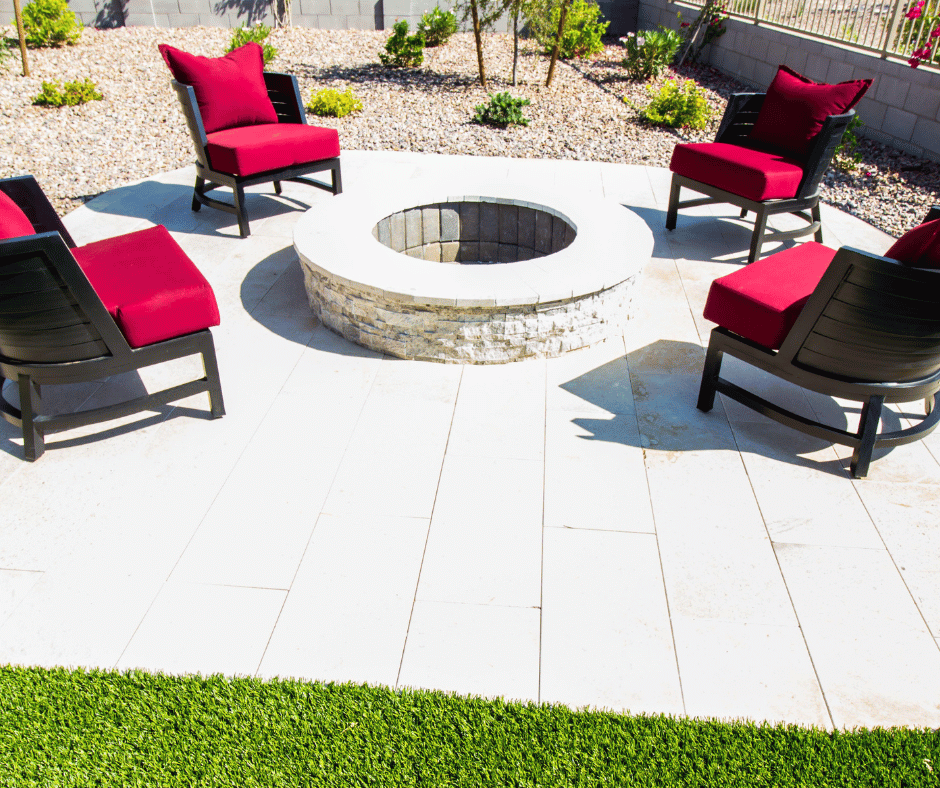
What it looks like: Soft off-white tones with warm undertones—cream, bone, ivory, natural linen. Never stark bright white or cool gray-white.
Why it's trending: Light, bright outdoor spaces feel larger and more open—particularly valuable in smaller urban Twin Cities yards. Cream tones achieve this openness while avoiding the stark, institutional feel of pure white.
Minnesota advantages:
Considerations:
Best for: Shaded patios needing brightness, small urban spaces requiring visual expansion, contemporary homes with white/cream exteriors, covered patios protected from direct soil contact, meticulous homeowners willing to maintain pristine appearance.
Color names to request: Cream, bone, ivory, natural, linen, buff
Typical cost: $10-13 per square foot with integral color
Maintenance reality: Plan for professional cleaning every 1-2 years (versus 2-3 years for mid-tones) to maintain the bright, clean appearance that makes cream concrete attractive.
What it looks like: Rather than single solid color, multi-toned concrete incorporates two or more complementary colors creating depth and visual richness. Think natural stone's variations or aged material's patina.
Why it's trending: Single-color concrete, even in beautiful tones, can still feel somewhat flat and monotonous. Multi-toned effects add dimension and visual interest approaching natural materials' organic beauty.
Application methods:
Minnesota advantages:
Considerations:
Best for: Larger patios benefiting from visual complexity, stamped concrete where multi-toning enhances pattern, homeowners wanting natural stone appearance, properties where premium outdoor finishes match home's overall quality level.
Color combinations to consider:
Typical cost: $15-22 per square foot depending on complexity
What it looks like: Colors inspired by Minnesota's natural landscape—river rock grays, iron-rich clay reds, sandstone buffs, lake shore tans, prairie grasses' golden tones.
Why it's trending: There's growing appreciation for regionally-appropriate design that connects homes to their specific geographic context rather than importing styles from completely different climates and landscapes.
Minnesota-specific inspirations:
Minnesota advantages:
Best for: Homeowners valuing regional identity, properties incorporating local stone or materials, landscapes featuring native plantings, families planning to stay long-term in Minnesota.
Implementation approach: Rather than copying exact natural colors, draw inspiration from them. A concrete patio doesn't need to match Mississippi limestone exactly—a warm gray-tan "inspired by" limestone creates regional connection while maintaining contemporary appeal.
Typical cost: $10-15 per square foot depending on specific color choices
Strategic use of multiple colors creates visual interest and functional definition without busy patterns.
The concept: Use one color for the main patio surface with a different (usually contrasting) color for borders defining the perimeter.
Effective combinations:
Why it works: Creates finished, intentional appearance while defining the patio's boundaries. Darker borders tend to recede visually, making the main patio area feel larger.
Typical costs: Add $2-4 per square foot for border work
The concept: Use subtle color variations to define functional zones (dining area, lounging space, pathways) without physical barriers or material changes.
Effective approaches:
Why it works: Creates organization and visual interest while maintaining material consistency and Minnesota durability.
The concept: Incorporate narrow strips or geometric shapes in accent colors within the main patio surface.
Effective applications:
Design caution: These require skilled execution to avoid looking busy or dated. Less is more—one or two strategic accents work better than numerous competing elements.
With all these options, how do you actually decide? Use this framework:
Your patio color should complement—not clash with—your home's architecture and materials.
Brick homes: Warm tones (taupe, terracotta, tan) create cohesion; charcoal can create sophisticated contrast
Stone or stucco homes: Match or complement stone tones; neutral grays and tans work universally
Wood siding homes: Earth tones and warm neutrals feel natural; avoid colors competing with wood's warmth
Modern siding (cement board, metal): Bold colors (charcoal, sage) work well; clean creams suit minimalist aesthetics
Your patio exists within the broader landscape context.
Heavily landscaped yards: Neutral patio colors (grays, tans) let gardens shine; green tones create seamless transitions
Minimal landscaping: Patio color becomes more prominent feature; bolder choices acceptable
Pool areas: Lighter colors reduce heat absorption; blues and aquas can feel too matchy with water
Practical considerations should influence color choice.
Full sun exposure:
Shaded areas:
High traffic areas:
Entertainment-focused patios:
Be honest about your maintenance willingness.
High maintenance tolerance: Cream and light colors work if you'll commit to frequent cleaning
Moderate maintenance: Most mid-tones (taupe, tan, sage) require standard care
Low maintenance priority: Charcoal and earth tones hide the most between cleanings
Think about your timeline and broader market appeal.
Staying 15+ years: Choose colors you love; your daily enjoyment justifies personal preference
Selling within 7 years: Neutral, broadly appealing colors (taupe, warm gray, tan) maximize buyer appeal
Uncertain timeline: Mid-range neutrals offer safety and flexibility
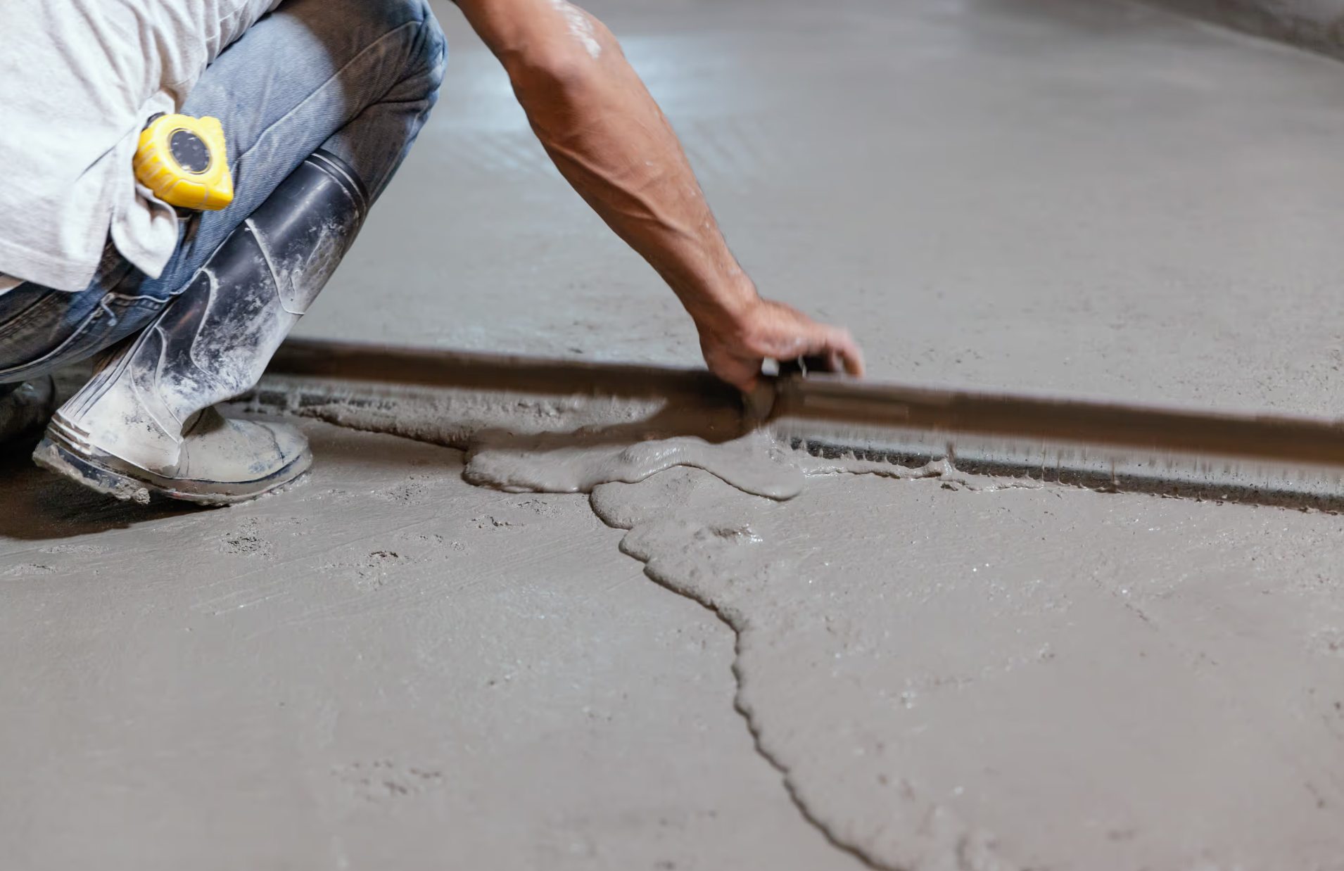
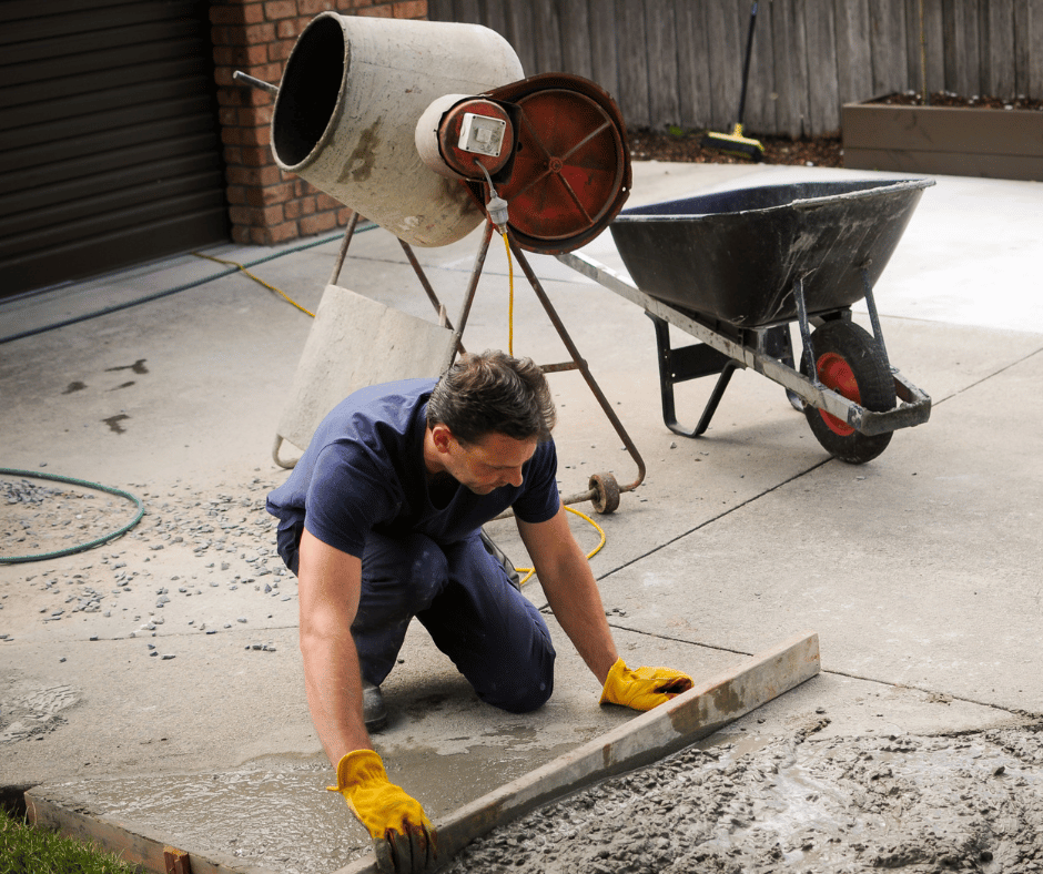
Even beautiful color choices fail without proper installation.
Achieving consistent color across an entire patio (especially large ones) requires skill and planning:
Concrete batching: All concrete should come from same plant using identical pigment batches
Mixing: Adequate mix time ensures even pigment distribution
Placement timing: Pour entire patio in one session or create clean cold joints between separate pours
Curing conditions: Temperature and moisture variations can affect color development
Sealing: Quality sealer enhances and protects color while creating uniform appearance
Never choose color from a small card or catalog alone.
Best practices:
Even with proper installation, understand realistic expectations:
Color variation: Some variation between batches is normal (typically not noticeable except in side-by-side comparison)
Weathering and patina: All concrete develops character over time; this is normal aging, not failure
Seasonal appearance changes: Concrete looks slightly different in different lighting conditions and seasons
Sealer enhancement: Sealed concrete appears richer and more vibrant than unsealed; resealing maintains this
Colored concrete is more complex than it appears. Poor execution creates expensive disappointments you'll see every day for 25-30 years.
What makes Preferred 1 Concrete your right choice for colored concrete patios:
We've perfected color consistency. With over 20 years creating colored concrete throughout the Twin Cities, we've developed relationships with concrete suppliers ensuring consistent batching, we understand timing and techniques preventing color variation, and we stand behind our color matching commitments.
We help you choose wisely. Rather than just installing whatever color you request, we'll discuss how your choice works with your home, landscape, and lifestyle. We'll steer you away from choices that might disappoint and toward colors that will make you happy for decades.
We engineer for Minnesota first, aesthetics second. Beautiful colored concrete that fails after three winters helps no one. Every patio gets proper base preparation, climate-appropriate concrete mix design, and quality sealing—fundamentals ensuring your color remains beautiful because the concrete remains sound.
We communicate honestly about maintenance. We'll tell you which colors require more upkeep, how to protect your investment, and what realistic expectations should be. No surprises, no disappointments.
We've built our reputation on satisfied customers. Twenty years of successful Twin Cities projects and referrals from delighted homeowners prove our commitment to excellence.
You don't have to live with boring gray concrete anymore. Modern color options give you the durability Minnesota demands with the beauty you deserve.
Contact Preferred 1 Concrete today to schedule your free design consultation. We'll help you explore color options, see samples in your actual space, and create a detailed plan for your stunning new patio.
Call us or schedule online to get started. Every summer you spend looking at that dull gray slab is a summer of outdoor enjoyment you're missing. Let's create the inviting, beautiful outdoor space you'll feel proud to show off.
Preferred 1 Concrete creates beautiful, durable concrete patios throughout Minneapolis, St. Paul, and the Twin Cities South Metro. We also specialize in concrete driveways, driveway aprons, and complete hardscaping projects. With family roots in concrete construction since the 1980s and over 20 years serving Minnesota homeowners, we have the expertise to deliver colored concrete that stays beautiful for decades. View our portfolio or contact us to discuss your color vision.


.png)
.png)
.png)
.png)
.png)


.png)
.png)


